> ## Documentation Index
> Fetch the complete documentation index at: https://wb-21fd5541-feat-cli-docs-generator.mintlify.site/llms.txt
> Use this file to discover all available pages before exploring further.
# Scatter plots
이 페이지에서는 W\&B에서 산점도를 사용하는 방법을 보여줍니다.
## 유스 케이스
산점도를 사용하여 여러 run을 비교하고 실험의 성능을 시각화합니다.
* 최소, 최대 및 평균값에 대한 선을 플롯합니다.
* 메타데이터 툴팁을 사용자 정의합니다.
* 포인트 색상을 제어합니다.
* 축 범위를 조정합니다.
* 축에 로그 스케일을 사용합니다.
## 예시
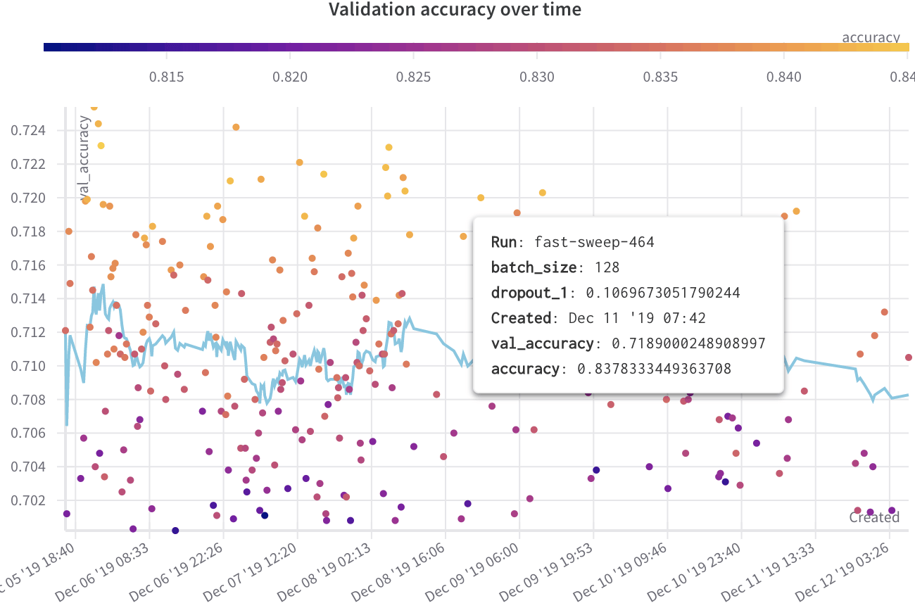
다음 예시는 몇 주간의 실험에 걸쳐 다양한 model의 검증 정확도를 표시하는 산점도를 보여줍니다. 툴팁에는 배치 크기, 드롭아웃 및 축 값이 포함됩니다. 선은 또한 검증 정확도의 이동 평균을 보여줍니다.
[라이브 예시 보기 →](https://app.wandb.ai/l2k2/l2k/reports?view=carey%2FScatter%20Plot)
 ## 산점도 만들기
W\&B UI에서 산점도를 만들려면 다음을 수행합니다.
1. **Workspaces** 탭으로 이동합니다.
2. **Charts** 패널에서 액션 메뉴 `...`을 클릭합니다.
3. 팝업 메뉴에서 **Add panels**를 선택합니다.
4. **Add panels** 메뉴에서 **Scatter plot**을 선택합니다.
5. `x` 및 `y` 축을 설정하여 보려는 데이터를 플롯합니다. 선택적으로 축의 최대 및 최소 범위를 설정하거나 `z` 축을 추가합니다.
6. **Apply**를 클릭하여 산점도를 만듭니다.
7. Charts 패널에서 새로운 산점도를 봅니다.
## 산점도 만들기
W\&B UI에서 산점도를 만들려면 다음을 수행합니다.
1. **Workspaces** 탭으로 이동합니다.
2. **Charts** 패널에서 액션 메뉴 `...`을 클릭합니다.
3. 팝업 메뉴에서 **Add panels**를 선택합니다.
4. **Add panels** 메뉴에서 **Scatter plot**을 선택합니다.
5. `x` 및 `y` 축을 설정하여 보려는 데이터를 플롯합니다. 선택적으로 축의 최대 및 최소 범위를 설정하거나 `z` 축을 추가합니다.
6. **Apply**를 클릭하여 산점도를 만듭니다.
7. Charts 패널에서 새로운 산점도를 봅니다.